Resume
My Brand
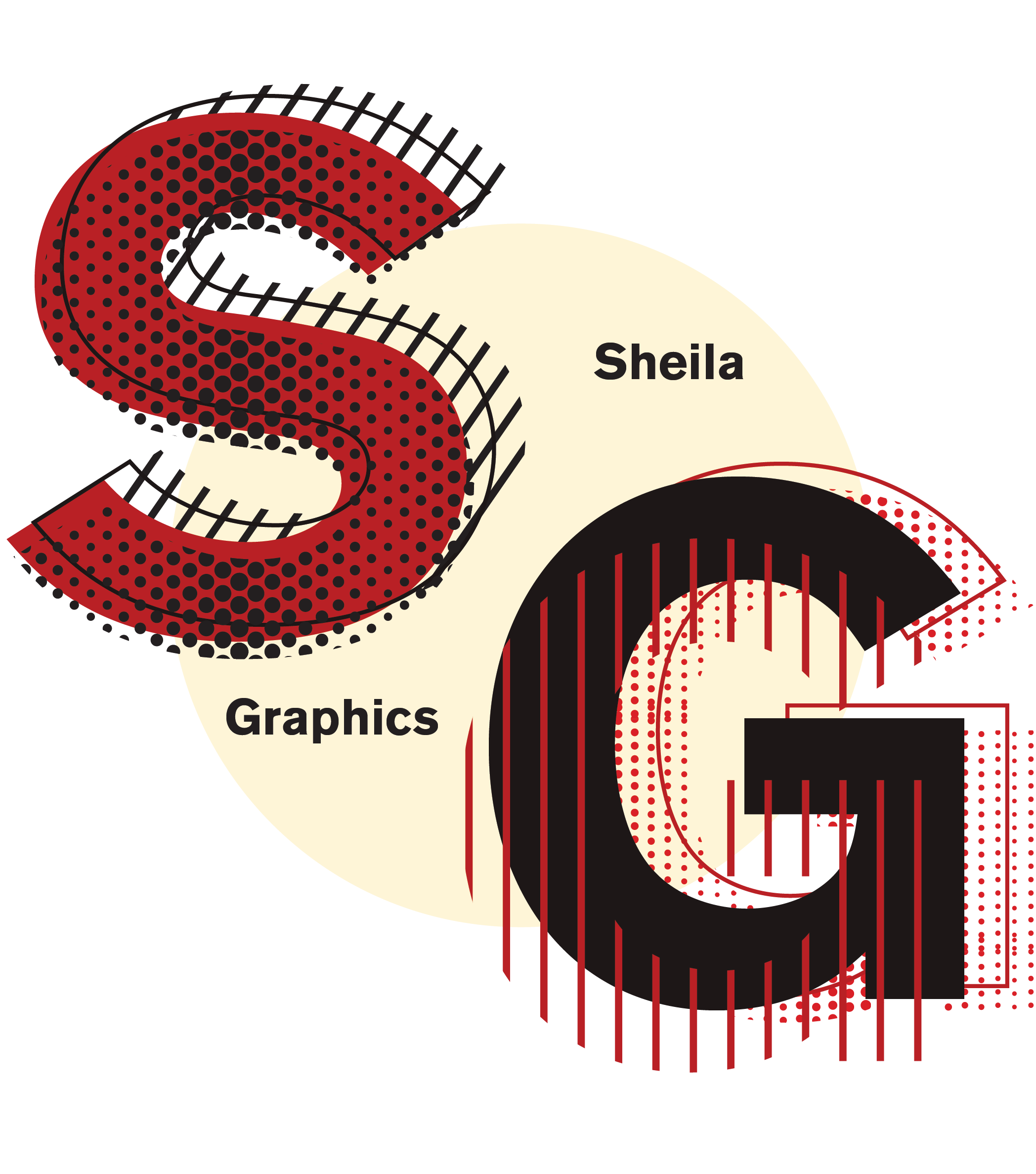
My design represents a culmination of all the styles I’m influenced by, and those are the art movements of German Expressionism, Bauhaus, Russian Constructivism, Swiss as well as the Grindhouse, Punk and Grunge aesthetic.
The visual elements I use to represent these styles are: distorted typography from German Expressionism, the bold contrasty colors from Russian Constructivism, the minimalist san-serif and grotesk typography from the Swiss, and I also employ various overlapping elements, dot and halftone textures, line patterns, and grain to achieve the grunge and punk look. The Grindhouse aesthetic consists mostly of a combination of grunge textures, lurid headlines and illustrations, and distorted or scratchy typography.
Out of all the basic shapes, I love the circle shape. At first, I couldn’t really decide which shape I wanted to be my main logo, because I really wanted it to be in the form of an eye or circle. In the end, I decided to warp the text to make it look like an inverted eye and contain it within a circle so it would seem more cohesive.
As far as typography, like I mentioned above, I really like the san-serif grotesk type, Berthold Akzidenz Grotesk and I keep coming back to it in all my design projects. I think it’s a strong font and compliments the design style of my logos. The other font’s that I use regularly are Arial black, Helvetica, Lemon Milk, Facile Sans, and Univers.
My Design Mood Board
